Redesigning Group Dashboard
Project Overview
In this case study, I am going to talk about one of my massive projects - Group Dashboard.
For me, dashboards are one of the most interesting problems of communication design. There is data which needs to be communicated and there’s a user who is interested in the story. I was the sole designer who owned this project and worked on it from start to finish. But I did collaborate with a lot of other people for this project.
- Product Managers:
To understand the whole scope of the project and its requirements. There were a lot of new things we were introducing like the dashboard and revamping a few of the existing flows such as the activities. - Senior Designers and stakeholders:
To get timely feedback on my designs and the design direction. - Engineering Team:
I am always in loop to understand technical things and To ensure that the final output matched the design exactly.
What is Group Dashboard
Group dashboard contains Blogs, Discussions, and Activity Streams where you can set up discussion boards to generate ideas, discuss and resolve problems, share and discover content, and collaborate on projects. It also provide a place to share and discuss materials in just about any form such as documents, links, audios, and videos.
Approach
To initiate the process, I began by studying multiple projects shared on Behance and Dribbble for inspiration. parallely I started ground study of existing design to understand the problems, Identified strengths and weaknesses in the current approach, Gather feedback from team members and stakeholders.
I took the challenge of deviating from the common practice and presenting data in a simple and understandable format as possible. If simplicity comes at a cost of aesthetics, then be it.
Existing Design
So the product manager provided me requirements of the various pages that the dashboard should have and any new additions. Here is how the page structure looked.

Key Findings
- No specified search & filter to find particular item
- Information hierarchy missing
- For every contribution there is different menu
- Repetitive data, inconsistent
- Not Accessibility compliant
- Cognitive load to understand user's activity
- Too lengthy and complicated, with too many steps to contribute something
- The board did not offer personalized content or recommendations, making it feel generic and less relevant to individual users.
- Users did not feel the dashboard catered to their specific fitness goals and preferences, reducing their motivation to engage.
Competitive study
Conducting a competitive study of LinkedIn and Facebook group modules involves analyzing their features, strengths, and weaknesses to understand how each platform supports group interactions, community building, and user engagement. Here is a comprehensive comparison:
LinkedIn groups excel in fostering professional networks, industry discussions, and career-related content. They offer a more formal and professional environment suitable for career development and industry-specific interactions.
Facebook groups, on the other hand, provide a more versatile and engaging platform with rich media support, diverse group topics, and higher user interaction. They are ideal for building vibrant communities around shared interests, both personal and professional.
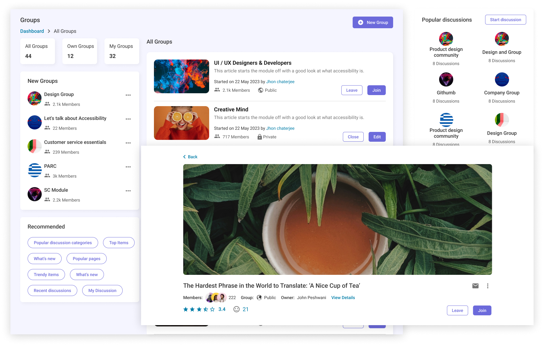
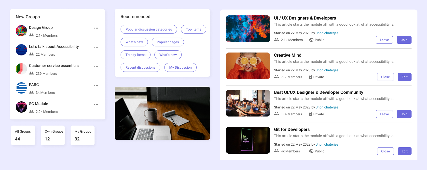
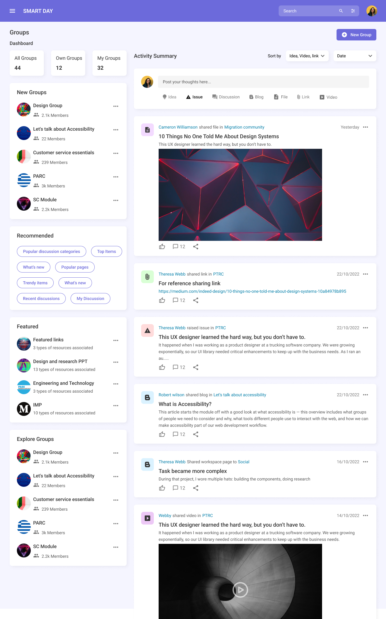
Statistics Dashboard
The first thing on the list was to create a new statistics dashboard that would give insights about the overall groups. This dashboard did not exist earlier.Right at the beginning, I knew how I wanted the dashboard to look. Big blocks of content, large texts, and an appropriate amount of color. The design was quite simple and did not need a lot of iterations. Identifying what content to show was the tricky part.
So let’s break this down one by one.
Basic structer of dashboard
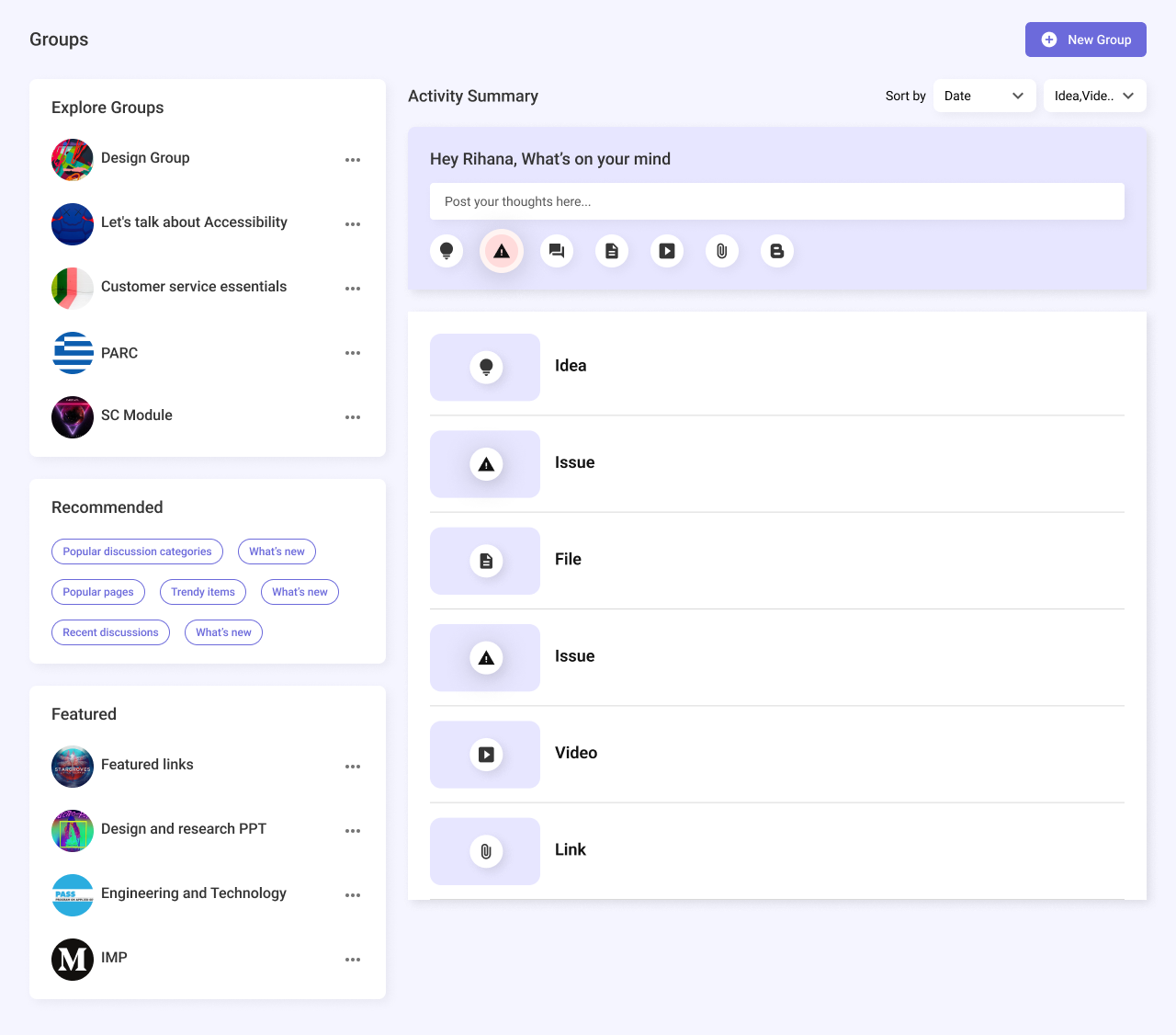
Dashboard contain different portlets. Firstly I start with primary portlet- activity summary where user can share different items like idea, issue, file then the Group listing where user can see own groups, groups they joined, groups based on profile with high level data and the group which are marked as featured.
Solution1
Here I start to arrange the data, but I feel activity summary is just look like comment panel and somewhere activity is not highlighting I also got same feedback from peers, also dashboard touch is missing.
.png)
Solution2
The next solution was to add image listing in activity summary so user gets better visualization in terms of blog, image and video. but its quiet useless when user not upload image specifically in terms of link, bugs
However rather than activity summary its look like listing of what user contributed
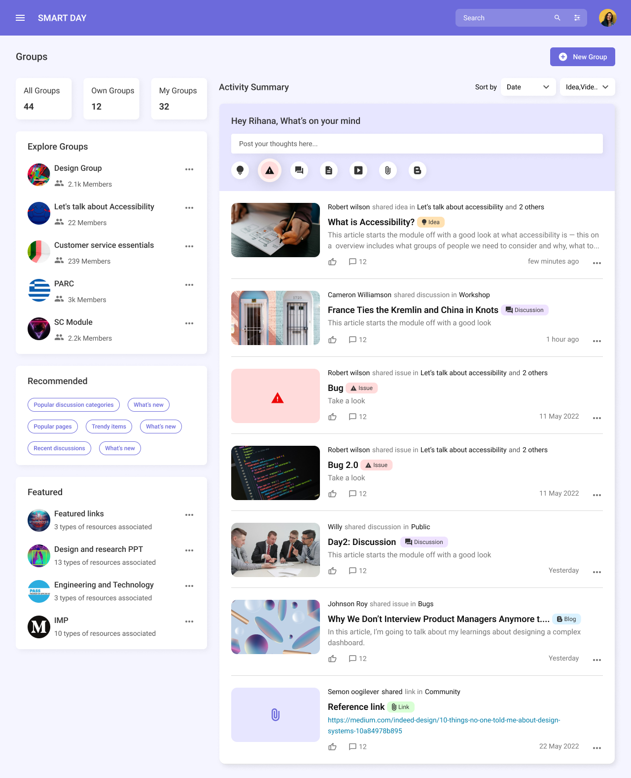
Final Outcome
After pondering over the findings followed by a series of iterations, I landed upon a design solution which did check most of the requirement boxes. Without compromising much on aesthetics, the solution allowed a user to understand the metrics without taking a course in data visualization ;)
Secondary pages